Tech Ideas & Best Practices
You build a SharePoint intranet in two stages. First, plan the audiences, tasks and content owners it must serve. Then build it in Microsoft 365. Set a communication site as the home site and connect hub sites. Add task-based navigation, news, permissions and audiences, and surface it all in Teams through Viva Connections. A mid-sized organisation typically needs 8 to 14 weeks.
Last updated: 10 October 2026
Most guides stop after "create a communication site". This guide also covers what usually goes wrong after that: permissions, content migration, accessibility, Copilot readiness and licensing.
What is a SharePoint intranet?
A SharePoint intranet is a private company website built on SharePoint Online inside your Microsoft 365 tenant. It gives employees one place for company news, policies, documents, people and tools. Because it runs in your own tenant, it uses the same sign-in, permissions and security controls as the rest of Microsoft 365. There is no separate platform to host or secure.
A SharePoint intranet is usually made of three building blocks:
- A home site. The front door of the intranet, built as a communication site.
- Hub sites. Department or regional sites grouped under shared navigation and branding.
- Viva Connections. The layer that brings the intranet into Microsoft Teams on desktop and mobile.
Teams handles day-to-day collaboration. The intranet handles information everyone needs. Our guide on when to use SharePoint, OneDrive and Teams for company documents explains where each belongs.
What should you plan before you build a SharePoint intranet?
Plan four things before you open SharePoint: the business goals, the audiences, the top employee tasks and the content owners. Skipping this step is the main reason intranets go stale within a year. A page without an owner is out of date within months. A navigation built around departments, rather than tasks, makes people search instead of click.
Set measurable goals
Write two or three goals you can measure. Examples include "reduce HR policy questions by 30 percent" or "reach 80 percent of staff with leadership news each week". These goals decide which pages you build first.
Map your audiences
List every group that needs different content. Typical audiences are office staff, frontline staff, managers, new joiners and regional teams. Each audience later becomes a Microsoft 365 group or security group used for targeting.
List the top 20 employee tasks
Ask employees what they look for most. Use a short survey, five or six interviews and your help-desk ticket history. The answers usually include leave requests, payslips, policies, expense claims, IT help and the staff directory.
Name a content owner for every area
Every section needs a named owner and a review date. If nobody will own a section, do not build it yet. This single rule prevents most intranet decay.
How do you build a SharePoint intranet step by step?
You build the intranet in ten steps, in this order. Each step depends on the one before it. For example, navigation depends on your hub structure, and audience targeting depends on the groups you created during planning. Following the order avoids rework when you add departments later.
- Create a communication site for the home page. Use a communication site, not a team site. Communication sites are designed to publish to many readers. Choose the site language carefully, because you cannot change the default language after creation.
- Set it as the SharePoint home site. In the SharePoint admin centre, set the site as your organisation's home site. This makes it the landing page in the SharePoint app and the default dashboard source for Viva Connections.
- Create hub sites for departments or regions. Register each department site as a hub, or associate it with one. Hubs share navigation, branding and news roll-up without copying content.
- Design task-based navigation. Build global navigation from the employee task list, such as "Pay and benefits", "Get IT help" and "Policies". Keep menus to three levels or fewer.
- Apply branding. Set a theme from your brand colours, then add your logo and footer. Check colour contrast at this stage, not after launch.
- Build the homepage. Add news, quick links, events, a people search and one or two personalised areas. Our SharePoint intranet homepage best practices cover layout in detail.
- Set up news publishing. Decide who can publish company news and who approves it. Turn on page approval for the home site if legal or communications must review posts.
- Configure permissions and audience targeting. Give most staff read access to the home site. Target navigation links, news posts and web parts to the audiences you defined.
- Add Viva Connections in Teams. Add the Viva Connections app to Teams and pin it for all users. Build a dashboard of cards for frequent tasks.
- Test with real tasks, then launch. Ask ten employees to complete five real tasks each. Fix whatever slows them down before announcing the launch.
How should permissions and audiences work on a SharePoint intranet?
Use permissions to control who can see content, and audience targeting to control who is shown content. They are different tools. Permissions are a security boundary: a person without access cannot open the page. Audience targeting is a relevance filter: a person outside the audience can still find the page through search or a direct link.
A simple, durable model looks like this:
Avoid breaking permission inheritance on individual pages and folders. Each break creates a hidden exception that someone must remember later. Our guide to SharePoint document library permissions explains how to keep sharing manageable.
How do you move existing content into a new SharePoint intranet?
Move content in three passes: inventory, clean-up, then migration. Most organisations find that 30 to 50 percent of old intranet content is outdated or duplicated. Migrating it unchanged recreates the old problems on a new platform. Content that nobody has opened in two years should usually be archived, not moved.
- Inventory. Export a list of every page and file, with owner, last-modified date and view count.
- Decide. Mark each item as keep, rewrite, merge or archive.
- Migrate. Move files with the SharePoint Migration Tool or a third-party tool. Rebuild key pages rather than copying their layout.
- Redirect. Point old links to the new pages so bookmarks keep working.
If you are moving from SharePoint Server 2016 or 2019, support for both ended on 14 July 2026. Our SharePoint 2016 and 2019 end-of-support migration guide covers the upgrade paths.
How do you make a SharePoint intranet ready for Copilot?
A SharePoint intranet is Copilot-ready when its content is current, owned and correctly permissioned. Microsoft 365 Copilot answers questions from content the user can already access. Therefore, outdated policies produce outdated answers, and over-shared files can surface in answers to people who should not see them.
Three checks matter most:
- Remove duplicates. One current version of each policy, with older versions archived.
- Fix over-sharing. Review sites shared with "Everyone except external users" that hold sensitive files.
- Add review dates. Give every policy page an owner and a next-review date.
Our AI-ready intranet checklist lists the full set of checks.
What licences does a SharePoint intranet need?
Every employee who uses the intranet needs a Microsoft 365 licence that includes SharePoint Online. Most business, enterprise and frontline plans include it, so many organisations already own everything required. Viva Connections is included in these plans too. Microsoft 365 Copilot is a separate licence and is optional for the intranet itself.
Prices are Microsoft list prices on annual commitment and vary by region and agreement. Microsoft 365 Copilot remains a separate add-on at $30 per user per month.
When is out-of-the-box SharePoint not enough?
Out-of-the-box SharePoint is enough for a clear, functional intranet with news, pages, documents and navigation. It falls short when you need a strong brand design, personalised dashboards, recognition, onboarding journeys or policy acknowledgement tracking. At that point you can add a ready-made product, commission custom SharePoint Framework (SPFx) web parts, or combine both.
Common gaps in standard SharePoint include:
- Birthday, anniversary and recognition feeds
- Onboarding checklists for new joiners
- Policy "read and understood" tracking with reminders
- Pixel-level brand design that looks like your public website
- Combined dashboards that pull from HR or ERP systems
The comparison of out-of-the-box versus custom SPFx web parts shows which gaps justify custom work. Sangha, our SharePoint intranet product, installs these components inside your own tenant.
How long does it take to build a SharePoint intranet?
A focused intranet built from a template takes 4 to 6 weeks. A custom-designed intranet for a mid-sized organisation takes 8 to 14 weeks. Planning and information architecture take the first 2 to 4 weeks. Build and content take 4 to 6 weeks. Testing, training and launch take the final 2 to 4 weeks.
Timelines slip for three common reasons:
- Content owners are named late, so pages wait for text.
- Brand approval takes several rounds.
- Migration starts before the clean-up decisions are made.
What should a SharePoint intranet launch checklist include?
A launch checklist confirms that the intranet works for real users, on real devices, with real content. Run it one week before launch. Fix every failed item before you announce the intranet, because first impressions decide whether employees come back.
- Every page has a named owner and review date
- Top 20 tasks can be completed in three clicks or fewer
- Search returns the right page for the top 20 task queries
- Pages pass colour-contrast and screen-reader checks (WCAG 2.1 AA)
- Mobile layout tested in the SharePoint app and Teams
- Viva Connections pinned in Teams for all users
- Old intranet links redirect to the new pages
- Usage analytics baseline recorded for week one
Our SharePoint intranet accessibility checklist covers the accessibility items in detail.

How to Build a SharePoint Intranet in 2026: A Step-by-Step Guide
You build a SharePoint intranet in two stages. First, plan the audiences, tasks and content owners it must serve.

AI document classification reads a document's content and decides what it is and where it belongs. In a family office, that means identifying the document type, such as a lease or a K-1. It also means identifying the entity it relates to, such as a trust, LLC or property. The system then applies metadata and files the document in the right place. A person confirms anything the AI is unsure about.
What Is AI Document Classification?
AI document classification is the automated labelling of documents by their content rather than their file name. A language model reads the text, recognises the document type and extracts key facts. Those facts include parties, dates, amounts and entity names. The system then writes them into metadata fields. Good classification turns an unstructured upload into a governed, searchable record that is linked to the right entity.
Traditional filing depends on the person who saves the file. They choose a folder, type a name and hope colleagues follow the same logic. Classification moves that decision from the person to the system.
Three capabilities sit underneath most classification tools:
- Document type recognition. The model decides whether a file is a lease, an operating agreement, a tax return or an insurance policy.
- Entity extraction. The model finds names, addresses, tax identifiers and account references inside the text.
- Metadata population. The system writes the results into structured columns, such as Entity, Document Type, Tax Year and Expiry Date.
Microsoft now builds this into SharePoint. Its autofill columns feature uses large language models to extract, summarise or generate content from uploaded files. It then saves the results as metadata automatically. Classification is therefore no longer a specialist add-on. It is becoming a standard part of document management.
Classification works best on a well-structured tenant. Our free AI Ready SharePoint Score shows how prepared an environment is before AI is switched on.
Why Do Family Offices Struggle to File Documents Correctly?
Family offices struggle because one document often relates to several entities at once. A single lease can involve a property LLC, a holding trust and a family member as guarantor. Folder trees force one location per file. Staff therefore duplicate files or file them inconsistently. Over time, nobody can say with confidence which version is current or which entity it belongs to.
The typical family office manages a dense web of structures. These include trusts, LLCs, partnerships, foundations, operating companies, properties and individual family members. Each structure generates its own steady stream of documents.
Common pain points include:
- Multi-entity documents. A capital call notice may affect a fund interest, a holding LLC and a trust beneficiary.
- Many contributors. Accountants, attorneys, advisers and family members all send documents by email.
- Long retention horizons. Tax filings, trust deeds and property records must stay findable for decades.
- High sensitivity. Estate plans and financial statements need strict, role-based access.
- Small teams. Most family offices have few staff, so manual filing competes with higher-value work.
The result is familiar. Documents sit in inboxes, personal drives and generic "Scans" folders. Search returns twenty near-identical files. Audits and tax deadlines become stressful document hunts.
How Does AI Decide Which Entity a Document Belongs To?
AI decides by matching facts inside the document against a register of known entities. The model extracts names, addresses, tax identifiers and account numbers. It then compares them with the family office's entity list. When a strong match appears, the system proposes that entity with a confidence score. When matches conflict or are weak, the document goes to a person for review.
The entity register is the critical ingredient. Without it, the AI can recognise "a lease" but cannot know which of twelve property LLCs owns the building.
The Classification Flow, Step by Step
- Step 1: Capture. A user drags a file into the system, or a rule picks it up from an email inbox.
- Step 2: Read. The system extracts text, including text from scanned images, using optical character recognition.
- Step 3: Identify type. The model classifies the document, for example "Commercial Lease" or "Schedule K-1".
- Step 4: Extract facts. The model pulls out parties, property addresses, tax years, amounts and key dates.
- Step 5: Match the entity. The system compares extracted facts against the entity register and scores each candidate.
- Step 6: Propose a destination. The system suggests the library, folder and metadata values.
- Step 7: Confirm or auto-file. High-confidence results file automatically. Lower-confidence results wait for one-click confirmation.
- Step 8: Log. The system records who filed what, when, and what the AI recommended.
What Signals the AI Uses
Strong entity signals include a legal entity name, an employer identification number, a property address and a policy or account number. Weaker signals include a family member's first name, an email sender or a file name. A well-designed system weights strong signals far more heavily than weak ones.
Should Family Offices File by Folder or by Metadata?
Family offices should file primarily by metadata and use folders only as a light, familiar wrapper. Metadata lets one document carry several entity tags at once, which folders cannot do. Folders still help people browse, so a hybrid works best. In practice, keep a shallow folder structure by entity and let metadata handle document type, year, status and cross-entity links.
A folder answers one question: where is this file? Metadata answers many questions at once: what is it, who does it relate to, when does it expire, and who can see it?
AI classification makes the metadata approach practical. The old objection to metadata was that people never fill in the fields. When the AI fills them in, that objection largely disappears.
For a wider view of where different Microsoft 365 tools fit, see our guide to choosing between SharePoint, OneDrive and Teams for company documents.
What Does an Entity-Centric Information Architecture Look Like in SharePoint?
An entity-centric information architecture treats each trust, company, property and family member as a first-class record. Documents link to those records through metadata rather than living only inside a folder. In SharePoint, the entity register is a list. Document libraries use lookup columns that point to it. AI classification then fills those columns automatically when documents arrive.
A practical metadata model for a family office usually includes the following columns:
This model supports the views family office staff actually need. Examples include "every document for Maple Street Holdings", "all K-1s for tax year 2025" and "leases expiring in the next 180 days".
Which Family Office Documents Can AI Classify Reliably?
AI classifies standardised documents very reliably and needs more human review on bespoke legal agreements. Tax forms, account statements and insurance certificates follow predictable layouts, so accuracy is high. Leases, operating agreements and trust deeds vary widely in wording and structure. For those, the AI should propose a classification and a person should confirm it before filing.
Reliability improves over time. Each confirmation or correction gives the system a clearer picture of how the office files documents.
Some offices go further and build a custom agent for the edge cases. Our AI agents built on Microsoft Copilot can handle multi-step filing rules, such as routing a capital call to finance before it is filed.
What Are the Main Options for AI Filing in a Family Office?
Family offices generally choose between three approaches. The first is a purpose-built family office platform. The second is a standalone metadata-driven document management system. The third is AI classification built natively into Microsoft 365. The right choice depends on where documents already live, how many tools the office wants to run, and how much control it needs over its data.
How Does DocVault Handle AI Classification Inside Microsoft 365?
DocVault, our AI-powered SharePoint document management system, runs inside the client's own Microsoft 365 tenant. It applies Copilot-powered auto-tagging and titles, governed templates, version approvals, audit trails and automated retention. Documents never leave the tenant. Because DocVault uses existing Microsoft 365 licences, a family office adds AI classification without adding a separate platform.
For family offices, the most relevant DocVault capabilities are:
- AI auto-tagging and titles. Copilot reads documents and applies consistent metadata and naming.
- Natural-language search. Staff ask "show me the Maple Street lease" instead of guessing folder paths.
- Dynamic filters. Users narrow results by entity, document type, status or date in a few clicks.
- Review and expiry tracking. The system sends pre-expiry and overdue notifications for leases, policies and agreements.
- Role-based permissions. Estate documents stay restricted while routine records stay widely accessible.
- Full audit trail. Every upload, edit, approval and access event is logged.
DocVault also supports compliance requirements, including SOX, ISO 27001, GDPR and HIPAA controls. Our post on document control in SharePoint for ISO, SOX and GDPR explains how those controls work in practice.
How Should a Family Office Roll Out AI Document Classification?
A family office should roll out AI classification in five stages. First, build the entity register. Second, agree the metadata model. Third, test on a sample of real documents. Fourth, set confidence thresholds. Fifth, migrate historical files in batches. Testing on the office's own leases, K-1s and trust documents matters most, because accuracy on real documents is the only meaningful benchmark.
- Step 1: Build the entity register. List every trust, company, property, account and family member, with legal names and identifiers.
- Step 2: Agree the metadata model. Define the columns, allowed values and collections before any AI runs.
- Step 3: Test on real samples. Run 20 to 50 representative documents and measure how often the AI picks the right entity and type.
- Step 4: Set confidence thresholds. Decide which document types may auto-file and which always need confirmation.
- Step 5: Migrate in batches. Classify historical content collection by collection, reviewing exceptions as you go.
Choosing the right migration tool affects how much clean-up the AI must do later. Our comparison of SharePoint migration tools covers the main options.
Our SharePoint document management solution covers the design and migration work behind these stages. Before starting, the free DMS Compliance Score tool gives a quick baseline of current document controls.
What Governance Controls Should Surround AI Filing?
AI filing needs four governance controls: human review for low-confidence results, role-based access, a complete audit trail and automated retention. These controls matter more in a family office than in most organisations. A misfiled trust document can expose sensitive family information. A deleted tax record can create real legal and financial risk.
- Human in the loop. The AI proposes; people decide on anything ambiguous or sensitive.
- Access by role and entity. Permissions should follow the entity and sensitivity metadata, not only the folder.
- Audit trail. The system should log the AI's recommendation alongside the final human decision.
- Retention policies. Tax, trust and property records need defined retention periods and protected disposal.
Classified documents also become far easier to search and reuse. Our AI knowledge management system for SharePoint builds on the same metadata to answer staff questions directly.
Microsoft Purview handles retention natively in Microsoft 365. Our guide to Microsoft Purview retention for SharePoint documents explains how to set it up correctly.
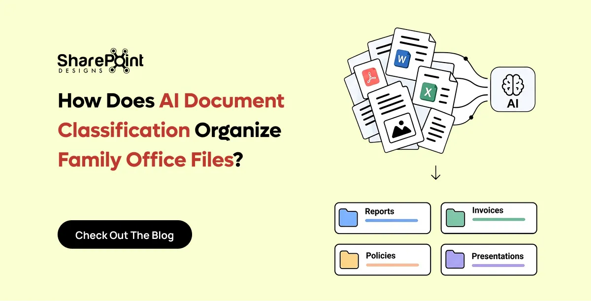
How Does AI Document Classification Organise Family Office Files?
AI document classification reads a document's content and decides what it is and where it belongs.

Retention conversations usually start in the wrong place. Someone opens the Microsoft Purview portal, clicks around labels, and hopes the lawyer’s spreadsheet will magically become policy. It won’t.
Here’s the order that actually works on SharePoint document libraries: paper map first, labels second, content types third, pilot fourth, tenant-wide last. Skip a step and you’ll spend months unexplained deletes, orphaned labels, or “why can I still edit this record?” tickets.
What Purview retention is (and isn’t) in SharePoint
In Microsoft 365, retention labels and retention policies tell Exchange, OneDrive, SharePoint, and Teams how long to keep content and what happens next delete, review, or retain as a record.
For SharePoint document libraries specifically:
- Retention labels can be published so users (or auto-apply rules) stamp a document.
- Label policies control where those labels show up.
- Records declaration (when you configure a label that marks items as records) is how you get immutability-style behavior restricted edit/delete depending on settings.
- Sensitivity labels are a different tool. They protect and classify for confidentiality (encryption, markings). Don’t confuse them with retention periods. Many programs need both. They solve different problems.
Out of the box SharePoint already gives you versioning, co-authoring, search, Purview retention labels/policies, and sensitivity labels. That’s the platform side. The governance side is still your job.
Step 1: Map retention on paper before you click anything
Sit with legal/compliance and build a simple matrix. Not a 40-tab workbook. A matrix:
Example periods only attributed as typical legal counsel ranges, not product guarantees. In many jurisdictions, financial records are often discussed around a ~7 year horizon. That is an illustration of how counsel commonly frames the conversation. Your actual period must come from your counsel, industry rules, and contracts. We do not publish DocVault or SharePoint Designs “standard” retention years because inventing them would be malpractice.
If counsel hasn’t signed the matrix, do not auto-apply delete labels tenant-wide. I’ve watched a team nearly enable a three-year delete on a library that held seven-year tax support. The pilot caught it. Barely.
Step 2: Design labels to match classes, not folders
One label per retention behavior, not one label per folder name.
Bad: Finance_2024_Folder_A_Keep7. Better: FIN-Retain-7Y-then-delete (or whatever naming counsel + IT agree), applied wherever finance accounting records live.
Publish the smallest set you can defend. Label sprawl is the new folder sprawl.
Expect lag
Label policies can take up to ~7 days to become available everywhere after you publish or change them. Plan demos and UAT accordingly. If someone tests thirty minutes after you hit Publish and the label is missing, that’s often propagation — not a broken tenant.
We burned a half-day of a CFO demo once because we assumed instant availability. Scar tissue: schedule Purview changes at least a week before any executive walkthrough.
Step 3: Put labels on content types (preferred path)
Users will not reliably pick the right retention label from a long list at upload time. Some will. Most won’t.
Stronger pattern:
- Define content types (Contract, Policy, Invoice support, Project deliverable, etc.).
- Associate the default retention behavior with that type’s governance model via default label settings / auto-apply where your licensing and configuration support it.
- Keep the upload experience: pick the content type (or use a controlled creation path), get the right metadata + template + retention intent together.
Content types also keep metadata honest: Document Type, Owner, Department, Status, Review Date typically in a 4–8 field band per type. Term store for Department and Document Type. Free text for narrative fields only.
Deep folder trees fight this. If you’re still nesting past three levels, fix information architecture first; see metadata vs folders in SharePoint. Retention labels on a chaotic tree just make deletion more confident and more wrong.
Step 4: Pilot before tenant-wide
Never start with “all SharePoint sites.”
Pilot shape we like:
- One department or one record class
- One or two libraries
- Clear owners who will file tickets when something feels off
- A disposition dry-run: what would delete in 90 days if this were production?
- Confirm records-declared items behave as legal expects (lock vs editable draft)
Only then expand. Tenant-wide label policies without a pilot are how you get surprise holds and surprise gaps at the same time.
Records declaration: when “keep” must mean immutable
Some programs need more than “don’t delete for N years.” They need a declared record: content that ordinary users can’t alter or remove under normal permissions.
Use records declaration deliberately. Overusing it frustrates collaboration (co-authoring and late edits collide with record locks). Underusing it fails audits that expect immutability after approval.
Pattern that holds up for controlled docs:
- Drafts: normal versioning, co-authoring allowed
- Approved / effective: declare record (or move to a records library with stricter controls), retain prior versions per policy
- Superseded: retain as record for the residual period; new version becomes current
SharePoint versioning alone is not a records program. It’s necessary plumbing.
Permissions still matter
Retention does not fix broken access.
- Prefer Microsoft 365 / security groups, not permission assignments to individual people
- Avoid item-level permissions as the default pattern
- Prefer libraries that are open by default inside the audience, restricted by exception — or split libraries when the boundary is hard
Why this shows up in a Purview article: auto-apply and eDiscovery follow access reality. If half the company can still read “confidential finance packs” because someone shared a folder link in 2022, your retention label is doing governance theater.
Same sprawl confuses Copilot, which grounds on SharePoint content the user can access. Wrong file usually means permissions sprawl, bad naming, no current-version clarity, or folder dumps — not a “model bug.” More in why Copilot returns the wrong document.
How this ties to document control (ISO / SOX / GDPR angles)
Retention is one control among several. Auditors also ask about approval evidence, ownership, review cycles, and — for policies — acknowledgement.
Out of the box SharePoint does not natively give you:
- Automatic document numbering
- Multi-stage approval with escalation
- Scheduled review / pre-expiry as a packaged loop
- Native read-and-acknowledge
- A controlled creation dashboard
For general controlled documents, we use DocVault on top of the SharePoint + Purview base. For policy lifecycle + acknowledgement, that’s SOP Manager — don’t mash those products together. GDPR-style erasure requests also need a process that knows what is a record vs what is deletable personal data; counsel owns that distinction, not a label name.
Broader control framing: document control in SharePoint for ISO, SOX, and GDPR. Platform choice context: can SharePoint be a DMS?, build vs buy, cost.
Scale notes while you label
- Watch the 5,000-item view threshold — indexed columns on Status, Document Type, Department keep review views usable.
- Treat ~100k items per library as a planning checkpoint. Retention jobs and admin views get harder in mega-libraries without splits.
- Network-drive lift-and-shift that recreates deep folder trees makes Purview rollout worse, not better. Migrate with a class map, not a tree clone — network drive to SharePoint.
Where DocVault fits (softly)
Purview answers “how long do we keep this?” DocVault answers “how do we run controlled creation, numbering, multi-stage approval with escalation, and review-before-expiry inside the tenant?” — on top of SharePoint, one-time pricing (see the product page), unlimited users, in-tenant Microsoft 365. If retention mapping is done and the remaining gap is operational document control, look at DocVault — flat one-time, unlimited users, runs inside your tenant. Current pricing is on that page. For the full architecture narrative, the DMS guide is the deep link.
It depends: if counsel hasn’t approved the retention matrix, buy that workshop before any product conversation. Labels on unclear classes just automate confusion.
Microsoft Purview Retention for SharePoint Documents
Retention conversations usually start in the wrong place. Someone opens the Microsoft Purview portal, clicks around labels,
The loudest Microsoft 365 file question I still get Reddit threads, ATP forums, Slack DMs from clients mid-migration is not “which product is better.” It is “where should this file live so we do not lose it when someone leaves.”
SharePoint, OneDrive, and Teams are not three competing DMS products. They are three surfaces on one tenancy, with very different ownership and lifecycle behaviour. Treat them as competitors and you get orphaned OneDrive folders, Teams chat attachments nobody can find, and “shared drives” that are really someone’s personal cloud with Extra Sharing Links.
I use one boring rule on engagements: personal work in OneDrive, company system of record in SharePoint libraries, Teams as the collaboration UX that often sits on top of those libraries.
Decision table: where the file belongs
That table closes most arguments. The rest of this post is the edge cases that still burn tenants.
Teams is mostly UX over SharePoint
When someone says “we store everything in Teams,” ask: channel Files or chat?
Channel Files for a standard team opens a SharePoint site behind that team. The Files tab is a document library (often Documents) with folders per channel. Co-authoring, version history, and site permissions come from SharePoint. If you need metadata columns, content types, or Purview labels on those files, you configure the SharePoint library, not a mythical “Teams storage product.”
Chat files are different. Attachments in private chats and many group chats are tied to the uploader’s OneDrive (shared automatically with chat participants). That is convenient for a quick PDF. It is a terrible system of record. When the uploader leaves and OneDrive is wiped without transfer, the chat still shows a dead link and the “company file” is gone.
I tell project leads: if the file matters after the meeting, put it in the channel library or a dedicated SharePoint library and paste the link in chat. Do not treat the paperclip as archival.
People also confuse “Teams for sharing” with “we do not need SharePoint.” You already have SharePoint if you have Teams. The question is whether you will design libraries and permissions — or inherit whatever default the team creation wizard gave you. That is the same design tension as build vs buy a SharePoint DMS: convenience defaults vs intentional control.
“I just want shared file storage”
Fair ask. After a file share migration, many teams only want a place that is not a mapped drive.
You still need:
- A SharePoint library (or several) owned by a Microsoft 365 group / security groups — not a pile of personal OneDrive shares.
- A permissions model — Contribute for authors, Read for broader audience, External sharing locked down if the content is sensitive. Person-by-person sharing links do not scale; they recreate the “who has access?” mystery of the old drive.
- A home people can find — hub navigation, Teams tabs, or both — so “shared storage” is not twenty orphaned sites named after departed PMs.
If your real pain is deep folders and unfindable names, fix structure with metadata vs folders rather than inventing a fourth place to dump files. If the pain is “we need controlled documents,” storage alone will not save you — same lesson as the Dropbox/Drive comparison in SharePoint vs Dropbox document management.
Offboarding: the OneDrive trap
Employee leaves. Their OneDrive held “the” customer proposal pack, the board deck template, and half the Q3 budget working files shared with “anyone in the org who asked.”
Microsoft gives you manager access / OneDrive retention windows and transfer tools. Use them. But do not design company knowledge to depend on that rescue process.
Patterns that fail:
- “Shared with me” as the department filing system
- Critical SOPs living only under an individual’s My files
- Teams chat attachments as the only copy of a signed agreement
Patterns that survive:
- Move company-owned work into a SharePoint library before it becomes critical
- Ownership = group, not person
- Offboarding checklist includes: transfer remaining OneDrive company content, revoke sharing links, confirm library membership via groups
I have watched a finance close miss a day because the only current reconciliation workbook was in a departed analyst’s OneDrive and transfer had not finished. The file was “in Microsoft 365.” It was not in the company’s document system.
Libraries vs team sites (high level)
A team site is a SharePoint site usually backed by an M365 group — home for channels, Planner, and a default document library. A document library is the container for files inside a site. You can have multiple libraries on one site (Contracts, Working Drafts, Archive) with different columns and permissions.
For company documents, think in libraries and groups first; Teams channels are how many people enter those libraries. If you need a quiet system of record with no chat noise, a communication site or dedicated team site with libraries and no Teams team is fine. Do not force every controlled library into a chatty team just because “everyone lives in Teams.”
When controlled docs enter the picture
Once the question is not “where do we put the file” but “who approved the current version, when does it review, and can we prove access,” you have left consumer-style sharing. SharePoint libraries can host that design. Out of the box they still lack many controlled-document behaviours — numbering, multi-stage approval with escalation, scheduled review, read-and-acknowledge patterns — that regulated and quality-heavy teams expect. That gap is why we package those behaviours in DocVault: runs in the customer M365 tenant, data stays in tenant, unlimited users, one-time flat fee (details on the product page). Broader design context: document management system guide.
For retention and labels on those libraries, pair this with Purview retention for SharePoint documents. For ISO/SOX/GDPR-style control conversations, see document control in SharePoint.
Practical migration habits
If you are leaving network drives, do not land everything in OneDrive “for now.” That recreates personal silos in the cloud. Use a library-first map — network drive to SharePoint migration — and teach Teams as the front door, not the filing cabinet.
Cost conversations belong next to licence and labour reality, not product mythology: SharePoint document management cost. Platform choice vs specialist DMS: SharePoint vs M-Files.
It depends on whether “company document” means a living team asset or a personal draft. Get that wrong and every other Microsoft 365 feature — search, Copilot, retention — inherits the mess.
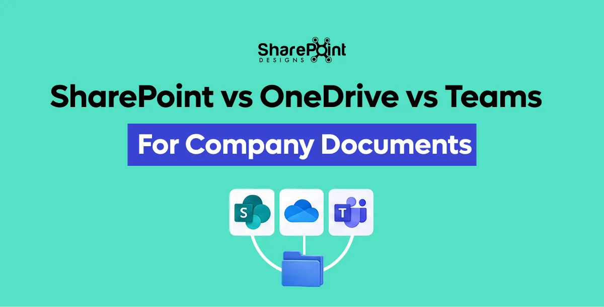
SharePoint vs OneDrive vs Teams for Company Documents
The loudest Microsoft 365 file question I still get Reddit threads, ATP forums, Slack DMs from clients mid-migration is not “which product is better.”

“We need SharePoint to be audit-ready for ISO / SOX / GDPR” usually means four different things smashed into one sentence. Ownership. Approval evidence. Retention. And sometimes proof that people actually read the policy.
SharePoint can carry a serious controlled-document program. It is not, out of the box, a complete document control system. Knowing which layer does what saves you from buying the wrong thing or building a brittle Power Automate forest you’ll regret in nine months.
Two products, two jobs (read this first)
Inside SharePoint Designs we split the problem on purpose:
Don’t confuse them. DocVault is not your acknowledgement engine. SOP Manager is not your general engineering DMS. Auditors care about both classes of evidence; the tooling shouldn’t pretend they’re identical.
What “document control” means in audit language
Strip the acronyms. Controllers and auditors typically probe:
- Is there a current approved version and can we prove it?
- Who owned it, who approved it, when?
- Are obsolete versions retained or withdrawn per policy?
- Do retention and deletion match legal/regulatory periods?
- For policies: did the right people attest?
- Who can change what?
ISO-style quality systems lean hard on (1)–(3) and often (5) for SOPs. SOX-style ITGC / financial reporting controls lean on change control, access, and retention evidence around financial-relevant docs. GDPR leans on lawful retention, minimization, and being able to find/erase personal data when required which collides with “keep forever” culture.
SharePoint participates in all of that. It doesn’t auto-complete any of it.
What SharePoint already gives you (use it)
Out of the box, treat these as foundation not the finish:
- Versioning — major/minor if you configure it; history of who changed what
- Co-authoring — real-time editing in Office files
- Microsoft Purview retention labels/policies — keep/delete/record timelines
- Sensitivity labels — confidentiality markings / protection
- Search — findability when IA isn’t a dumpster
That’s a stronger base than most file shares ever had. For how retention should be designed (paper map → labels → content types → pilot), see Purview retention for SharePoint documents.
What SharePoint does not give you natively
These gaps show up in almost every controlled-document RFP we see:
- Automatic document numbering (SOP-004 Rev C style schemes that don’t depend on filename discipline)
- Multi-stage approval with escalation (not a single “approve” button someone forgets)
- Scheduled review / pre-expiry as an operational loop, not a calendar reminder someone created once
- Native read-and-acknowledge for policies
- Controlled creation dashboard stop random “Upload” into the wrong library with no type, no owner, no template
You can approximate pieces with Power Automate, list formatting, and custom SPFx. We’ve done it. It depends on how much you enjoy owning that code when the maker leaves. Honest build-vs-buy framing: build vs buy a SharePoint DMS and SharePoint document management cost (DocVault is one-time pricing (see the product page), unlimited users, in-tenant Microsoft 365 when packaged beats DIY).
Information architecture auditors can follow
Control fails quietly when the library is a folder museum.
Rules we enforce on controlled libraries:
- Metadata over deep folders. More than three folder levels → redesign. Prefer columns and views.
- 4–8 fields per document type. Baseline: Document Type, Owner, Department, Status, Review Date.
- Term store for Department / Document Type — not free text.
- Content types bundle metadata + template + retention intent.
- Stay ahead of the 5,000-item view threshold with indexed columns; treat ~100k items/library as a split-or-justify checkpoint.
Longer treatment: metadata vs folders. Platform question: can SharePoint be a DMS?.
Permissions: the control that gets skipped
Wrong access blows SOX and ISO conversations faster than a missing metadata column.
Practical rules:
- Assign groups, not people
- Avoid item-level permissions as the default — they don’t scale and they’re invisible in day-to-day admin
- Prefer open by default inside the intended audience, restricted by exception — or separate libraries when the boundary is truly hard (HR vs everyone)
Item-level ACL spaghetti is also why Copilot surfaces the wrong draft: it grounds on content the user can access. Sprawl, bad naming, unclear current version, and folder dumps are the usual root causes — why Copilot returns the wrong document.
Mapping the three acronyms without fake certifications
We are not claiming DocVault or SharePoint Designs “certifies you” for ISO, SOX, or GDPR. Tools support a program. Auditors certify your program.
ISO-style quality / controlled documents
Focus: current approved copy, revision history, ownership, review cycles, obsolete control. SharePoint: versioning + content types + Purview + permissions. Add: numbering, multi-stage approval + escalation, scheduled review — DocVault territory for general controlled docs. If the artifact is a policy/SOP requiring attestation: SOP Manager, not DocVault.
SOX-oriented financial reporting / ITGC flavor
Focus: change control on documents that support controls, restricted access, retention of evidence, clear ownership. SharePoint: group-based permissions, retention labels, audit logs in M365. Add: controlled intake (no shadow uploads), approval trails that survive scrutiny. Retention periods: map with counsel. Example only — financial records are often discussed in ~7 year ranges as typical legal counsel planning figures; confirm for your entity. Not a DocVault guarantee.
GDPR-oriented privacy
Focus: know where personal data lives, retain only as long as lawful, respond to access/erasure where applicable, don’t treat every file as an immortal record. SharePoint: search + retention + minimization of open sharing. Process: records vs deletable personal data is a counsel call. Declaring everything a record “for safety” can fight erasure obligations. Purview records declaration is powerful — use it on purpose.
It depends on your regulator mix. A medical device ISO shop and a SaaS company with SOX-lite ITGCs should not copy-paste the same label set.
Scar: the acknowledgement we bolted on wrong
On a 2022 quality rollout we tried to fake read-and-acknowledge with a custom list + flow “to save budget.” It worked in UAT. In production, managers forwarded PDFs in email, people “acknowledged” the wrong revision, and the list fell out of sync with the document library. The auditor asked one simple question — “show me who attested to the effective version” — and the demo fell apart.
We replaced that path with a proper policy acknowledgement approach later (today we’d send that requirement to SOP Manager). The scar: don’t DIY attestation on the side of a general DMS. And don’t pretend a general DMS is an attestation product.
Migration warning for controlled estates
If you’re moving a network drive full of “controlled” folders into SharePoint by recreating the tree, you will import findability failure into an audit scope. Lift-and-shift folder clones fail. Classify, apply content types, then migrate. See moving a network drive to SharePoint. Comparisons for teams evaluating other repos: SharePoint vs M-Files, SharePoint vs Dropbox.
Putting DocVault in the right slot
When the SharePoint + Purview foundation is in place and the remaining gaps are numbering, multi-stage approval with escalation, scheduled review/pre-expiry, and controlled creation for general controlled documents that’s DocVault: in-tenant Microsoft 365, one-time (see the product page), unlimited users. Deep architecture: document management system guide.
When the requirement is policy lifecycle and read-and-acknowledge, use SOP Manager. Same SharePoint estate. Different control surface.
Document Control in SharePoint for ISO, SOX, and GDPR
We need SharePoint to be audit-ready for ISO / SOX / GDPR” usually means four different things smashed into one sentence.
“Search is broken” is rarely true. More often the file is invisible to you, not indexed yet, named like final_v3_REAL(2).docx, buried six folders deep with no metadata, or sitting in a library your tenant search scope never prioritises.
I treat findability as a design outcome same family as classification and access not as a magic bar at the top of the page. When Copilot cites the wrong MSA, the root cause is frequently the same estate hygiene that makes classic search disappointing. See why Copilot returns the wrong document.
Reason 1: Permissions trimming
SharePoint search (and Microsoft Search in M365) will not show results you cannot open. That is permissions trimming, not a bug.
If you are Visitor on site A and not a member of site B, site B’s contracts do not appear for you even if a colleague swears “it’s in SharePoint.” Ask: can this account open the file URL directly? If access fails, search will not save you. Fix membership/groups first; see document library permissions.
Trimmed results also confuse demos: admins search as themselves, see everything, declare search “fine,” then users with tighter roles see almost nothing. Always test as a representative reader account.
Reason 2: Crawl / index delay
After upload, rename, move, or major metadata change, there is a lag before the item is searchable everywhere. Seconds to longer depending on service load and change type — not usually days, but long enough for “I just put it there” tickets.
Practical habits:
- Wait and retry before opening an incident
- Open the library and use library search / filters (often fresher for that container) while tenant search catches up
- Avoid frantic re-uploads that create duplicates (“then search finds three and none is authoritative”)
If the file never appears for people who can open it after a reasonable wait, then look at site search settings, exclusion, or malformed content — not first-line panic.
Reason 3: Bad filenames and deep folders
Search works better when the query terms exist in the title, filename, or crawled properties. SCAN0004.PDF in Dept/Old/2019/misc/stuff/ with empty columns is hostile to humans and to the index.
Deep folder-only schemes also train people to browse instead of search then they blame search when browse fails. The durable fix is metadata people will actually fill: Document Type, Status, Owner, Department, Customer, Review Date covered in metadata vs folders in SharePoint.
I still allow a shallow folder for human comfort. I do not allow folder path to be the only classification.
Reason 4: Library scope vs tenant search
Users mix three experiences:
- Inside this library — search box on the library / filtered views
- This site — site search
- Work / tenant — Microsoft Search / SharePoint start page / Office.com
A file can be trivial to find in the library filter and hard to discover at tenant scope if naming is weak, the site is obscure, or the user’s habitual scope is wrong. Teach people to start narrow when they know the library, wide when they do not. Verticals and pinned results help at tenant level; they do not replace classification.
Hub sites and clear nav matter here: if nobody knows which site holds SOPs, tenant search becomes archaeology across dumps. Same lesson as treating SharePoint as a designed DMS: can SharePoint be a document management system?.
Reason 5: View threshold vs search
The 5,000-item list view threshold breaks or slows certain unfiltered list views. It is not the same as “search cannot find my file.” People conflate them because both feel like “SharePoint won’t show my documents.”
- Use indexed columns and filtered views for browse
- Use search for discovery across large libraries
- Do not build one mega-library that is both unfiltered-browse and ungoverned plan around Microsoft’s large-library guidance (~100,000 items per library as a planning signal)
Search is not a substitute for retention and archive. Junk in the index stays findable junk which is how superseded PDFs keep winning. Tie cleanup to Purview retention and clear Status values.
Checklist: users
Before you ping IT:
- Confirm you can open the file via a direct link someone sends — if not, it is access, not search.
- Try the library search box and filters (Status = Approved, Document Type, modified date).
- Search on exact filename and on a unique phrase from inside the document.
- Try an alternate account / Incognito only if you suspect wrong identity — not as theatre.
- Check whether you are in Teams chat history looking for a chat attachment (OneDrive-backed) vs the channel Files library — SharePoint vs OneDrive vs Teams.
- Wait a bit after brand-new uploads; re-check before declaring failure.
- Ask whether a duplicate or superseded copy exists under another name — search may be “finding” the wrong sibling.
Checklist: admins / site owners
- Verify permissions with a test reader account (trimming).
- Confirm the library is not excluded from search; check site-level “Allow this site to appear in search results.”
- Inspect naming and required metadata — empty crawled properties limit relevance.
- Index columns used in filters; fix views that hit the threshold.
- Reduce dumps: archive, retention labels, Status = Superseded.
- Review sharing sprawl — orphaned copies in OneDrive and chat create parallel “hits.”
- For Copilot complaints, re-test classic search with the same user; estate issues usually show in both.
Migration residue is a frequent root cause: lifted network-drive trees with no metadata. Fix on the way in when you can: network drive to SharePoint migration.
Duplicates and “which file is the real one?”
Search finding something is not success if it finds three competing truths. Prefer:
- One system-of-record library per document domain
- Status / version clarity (Approved vs Draft)
- Soft delete or archive of superseded PDFs that still match every query
This is governance, not a search tuning knob. Platform shopping and build-vs-buy debates do not fix duplicate MSAs: build vs buy, vs M-Files, cost.
When auto-tag and controlled patterns help
Manual metadata fails at 4:55 p.m. Findability then depends on whatever the uploader typed in the filename. Packaged patterns that push templates, auto-tag, and controlled creation improve the raw material search and Copilot both consume.
DocVault sits in that lane: controlled-document behaviours OOTB SharePoint lacks, running in the customer M365 tenant, data stays in tenant, unlimited users, one-time flat fee (pricing on the product page only). Broader context: document management system guide. It will not override permissions trimming or invent terms that never existed in the file close access and naming first.
It depends on whether “can’t find” means “no access,” “not indexed yet,” “never classified,” or “found the wrong duplicate.” Diagnose that split before you buy another search gadget.
Why SharePoint Search Can’t Find Your File (and How to Fix It)
SharePoint search (and Microsoft Search in M365) will not show results you cannot open. That is permissions trimming, not a bug.
Most SharePoint “security” tickets I see are not sophisticated attacks. They are inheritance accidents: someone shared a folder to fix a Friday deadline, Unique permissions multiplied, Limited Access ghosts appeared, and six months later nobody can explain who sees the contracts library.
Permissions are where DMS ambition dies quietly. You can have beautiful content types and still fail an access review because Contribute was granted to named people instead of groups, or because “Anyone with the link” became the unofficial external portal.
This post is the practitioner version: when each permission scope is justified, why unique permissions explode, how to share safely for company documents, and how to diagnose “why can’t I open / edit this?”
Site vs library vs folder vs item
SharePoint lets you break inheritance at almost every level. That flexibility is also the trap.
Site permissions — default Members / Visitors / Owners (or M365 group membership for team sites). Use this for “who belongs in this workplace.” Most company document libraries should inherit from here.
Library permissions — justified when one library on a site is more sensitive than the rest (HR on a broader intranet site, Legal contracts beside a working drafts library). Prefer a dedicated site when the sensitivity difference is large; unique library permissions are fine when the exception is clear and documented.
Folder permissions — sometimes justified for a sealed sub-area (e.g. “Board only” under a leadership library). Overused, they become a second taxonomy. If every folder has different people, you rebuilt NTFS ACLs in the cloud.
Item (file) permissions — last resort. Valid for a single sealed exhibit or a temporary review pack. Dangerous as habit. Item-level unique permissions are how you get support queues that cannot answer “who has access?” without exporting reports.
Rule of thumb I use on designs: groups at site (or library) level; folders for navigation and metadata, not for access design; items almost never. Pair with metadata vs folders so structure and security do not fight each other.
Why unique permissions explode (and Limited Access)
When you share a file or folder with someone who is not already a site member, SharePoint often grants Limited Access at parent containers so the user can reach the shared item without seeing everything else. Those Limited Access entries are not “extra roles you meant to invent.” They are scaffolding. They accumulate.
Symptoms:
- Permission reports full of Limited Access you did not plan
- “I can open this one file but the library looks empty”
- Inheritance broken on hundreds of items after a year of ad-hoc sharing
- External sharing links that outlive the project
Cleanup means restore inheritance where safe, move sealed content to a tighter library, replace person shares with groups, and delete stale links. Prevention is cheaper. If the estate still behaves like a network drive of personal shares, fix landing patterns in migration: network drive to SharePoint.
Group-based access over person-based
Company documents should grant access to Entra ID / Microsoft 365 groups (or SharePoint groups backed by those), not to long lists of named users.
Why:
- Joiner/mover/leaver becomes group membership, not editing 40 libraries
- Access reviews have a clear object (“Contract Approvers”)
- You can align roles authors, approvers, readers to business language
Person-based sharing is fine for a one-off partner review with an expiry. It is not a DMS access model. The same discipline shows up in regulated control work: document control for ISO, SOX, GDPR.
External sharing links vs guest access
For controlled company docs I separate three patterns:
- Internal only sharing links restricted to people in the organisation; prefer group membership over links when the person needs ongoing access.
- Guest (Entra B2B) named external user in the directory, auditable, can be removed, can sit in a group. Prefer this for ongoing vendor or auditor access to a library or site.
- Anyone / anonymous links convenient, weak for controlled documents. If policy allows them at all, short expiry, specific file, never for the system-of-record library as a whole.
“Sharing externally to non-members” is not one button. Decide whether the outsider is a temporary recipient of one PDF or a recurring collaborator. Recurring → guest + group. One PDF with expiry → restricted link if policy allows. Regulated SOP → usually neither without a documented exception.
Purview retention and labels do not replace access design; they complement it: Purview retention for SharePoint documents.
How to share a file safely (company documents)
Practical sequence I teach power users:
- Confirm the file lives in the correct SharePoint library (not OneDrive, not chat) see SharePoint vs OneDrive vs Teams.
- Prefer adding the person/group to the site or library role if they need ongoing access.
- If a link is required: people in your organisation or specific people, not Anyone, for anything non-public.
- Set expiry and view-only when edit is unnecessary.
- Avoid “stop inheriting” on the item unless you have a written reason and an owner who will clean it up.
- For Teams: share the library/channel file link, not a fresh OneDrive copy uploaded into chat.
Safe sharing is boring. That is the point.
Diagnosis checklist: “Why can’t I access / edit this file?”
Work top-down. I keep this list on engagements:
User side
- Are you signed into the correct tenant / work account?
- Do you have a sharing link vs site membership? Links can grant open without “I belong here” navigation.
- Is the file checked out to someone else, or required checkout enabled?
- Is there an IRM / sensitivity label blocking download or edit?
- Are you looking at a Teams chat copy vs the channel library copy?
Permissions
- Site Members vs Visitors vs unique library permissions?
- Broken inheritance on folder or item? Unique permissions report.
- Limited Access only can open shared item but not browse parent?
- Guest account invited to a different address than the one in use?
- Conditional Access / device compliance blocking Office clients?
Library settings
- Draft item security / major-minor versions readers cannot see minor drafts
- Content Approval pending items hidden from general readers
- Required metadata / content types blocking upload or save that users describe as “can’t edit”
Admin / audit
- Sharing link expired or revoked
- User removed from the M365 group behind the team
- Retention/hold confused with access (different issue, same ticket)
Most tickets resolve at “wrong copy,” “Visitors not Members,” or unique permissions from an old share. Search and Copilot will not show files you cannot open — trimming so findability complaints often start as access design: why SharePoint search can’t find your file, why Copilot returns the wrong document.
DMS angle: roles and audit-oriented patterns
A document management system needs access that matches roles Document Controller, Approver, Reader and an audit story you can explain. SharePoint can model that with groups and least privilege. It will not invent the role model for you.
When teams want those controlled behaviours packaged role-oriented permissions patterns, approvals, templates, audit-oriented trails on top of libraries that already sit in the customer tenant, that is the soft path to DocVault: data stays in tenant, unlimited users, one-time flat fee (see product page). Architecture context: document management system guide. Whether SharePoint alone is “enough” remains a design question: can SharePoint be a DMS?, build vs buy, cost framing.
It depends on whether you treat permissions as a Friday workaround or as part of classification, lifecycle, control, and access. Unique permissions-on-everything rarely survives the first serious access review.
SharePoint Document Library Permissions (Without Breaking Sharing)
Most SharePoint “security” tickets I see are not sophisticated attacks. They are inheritance accidents: someone shared a folder to fix a Friday deadline,

When Copilot cites the wrong file, the meeting goes sideways fast. Someone asks for the “current MSA with Contoso.” Copilot cheerfully summarizes a 2021 draft from a shared folder named Legal_OLD. Confidence is high. Accuracy is not.
Most teams blame the model. On SharePoint estates we implement, the model is often doing exactly what it should: answering from content that user can access, ranked through whatever naming, versions, and dumps you’ve left lying around.
Fix grounding by fixing the estate. Not by prompting harder forever.
How grounding actually behaves (practitioner version)
Microsoft 365 Copilot grounds on workplace content the signed-in user is allowed to see — SharePoint libraries, OneDrive, Teams files, mail/calendar depending on the experience. If a stale draft is still readable to that user, it is in play.
So when the wrong document wins, we check four root causes first:
- Permissions sprawl — too many people can still read abandoned spaces
- Bad naming —
Final,Final_v3,USE_THIS,Contoso MSA copy (2) - No current-version clarity — Status not in metadata; major/minor versions unused; five “approved” PDFs
- Folder dumps — network-drive trees lifted into SharePoint with no metadata discipline
That’s the diagnostic order we use on triage calls. Fancy prompt engineering is step five, if ever.
Root cause 1: Permissions sprawl
Classic patterns:
- Broad “Everyone except external” on a project site that never closed
- Unique item permissions from a 2020 panic share
- Guest links and “anyone in org” links that outlived the project
- Synced folders redistributed over email
Copilot doesn’t know the political history. It knows the ACL.
Fixes that stick:
- Prefer groups, not people
- Avoid item-level permissions as the default habit
- Prefer libraries open by default inside the audience, restricted by exception — or split libraries when exceptions dominate
- Run access reviews on high-risk sites before you “turn on Copilot training”
- Archive or lock dead sites so they stop being eligible context
If Finance can still open the 2018 benefits folder, don’t be shocked when benefits answers sound like 2018.
Root cause 2: Bad naming
Filenames are still a ranking and trust signal for humans and for how snippets show up.
Working conventions we actually get teams to follow:
- Client/vendor + doc type + date or agreement ID
- No
Finalin the name — put lifecycle in Status metadata - Stop uploading
Document.docxfrom desktop defaults - One working file, not email-attachment clones back into the library
Rename festivals fail if you don’t also delete or archive the losers. Renaming five copies to pretty names leaves five copies.
Root cause 3: No current-version clarity
SharePoint versioning is on in most libraries. That doesn’t mean users understand which file is current when five parallel files exist.
Controls that help Copilot and humans:
- Status column: Draft / In Review / Approved / Superseded / Archived
- Views: “Approved only,” “My drafts,” “Due for review”
- Content types so contracts don’t share a pile with picnic photos
- For controlled docs: approval gates before something can be Status = Approved
- Purview records declaration when the approved copy must become immutable
Out of the box you get versioning, co-authoring, Purview retention labels/policies, sensitivity labels, and search. You do not natively get auto numbering, multi-stage approval with escalation, scheduled review/pre-expiry, native read-and-acknowledge, or a controlled creation dashboard. Those gaps matter when “current” must be defensible in an audit — see document control for ISO, SOX, and GDPR.
Root cause 4: Folder dumps from network drives
Lift-and-shift recreating folder trees fails findability. It also fails Copilot.
Deep trees hide duplicates. Metadata-free libraries give the model little structure beyond path tokens and full text. Past three folder levels, we push redesign: metadata vs folders and network drive to SharePoint migration.
Minimum viable structure for Copilot-ready libraries:
- 4–8 metadata fields per type — Document Type, Owner, Department, Status, Review Date as the spine
- Term store values, not free-text departments
- Content types bundling metadata + template + retention
- Indexed columns so views survive the 5,000-item threshold
- Split libraries before ~100k items becomes an excuse for chaos
Sensitivity labels and retention aren’t optional side quests
Wrong-document risk isn’t only “stale.” It’s also “too sensitive to be in the answer set for this user.”
- Sensitivity labels reduce oversharing and mark confidentiality
- Retention labels/policies age out junk on purpose — after you map periods on paper with counsel, attach labels to content types, pilot before tenant-wide, and allow up to ~7 days for label policy propagation
Example retention horizons (illustrations attributed as typical legal counsel ranges, not product promises): financial records often discussed around ~7 years — confirm with counsel. Details: Purview retention for SharePoint documents.
Records declaration helps when an approved file must stop drifting. It does not fix five competing “approved” uploads. Process first.
What we try before blaming Copilot
A field checklist:
- Can this user open the wrong file in the browser without Copilot? If yes, grounding isn’t the bug — access is.
- Is there a single Approved item with clear Status for that agreement?
- How many near-duplicate filenames exist?
- Is the hit coming from an archived or abandoned site still in the user’s reach?
- Did a folder dump migration happen in the last year?
- Are we asking Copilot for a controlled policy acknowledgement problem? (Different tool — SOP Manager for read-and-acknowledge, not a chat thread.)
Scar: the “Copilot is broken” ticket that wasn’t
A sales VP insisted Copilot “hallucinated pricing” from a partner one-pager. We traced the citation. The one-pager was real, still in a public Sales Enablement library, never marked Superseded when the price book moved to a controlled library. Everyone in Sales could read both. Copilot picked the one-pager because the question matched its wording better.
We didn’t retrain anything. We archived the one-pager, set Status properly on the price book, and tightened the enablement library’s content types. The next demo answered from the price book. Scar: if you leave two truths readable, Copilot will eventually pick the convenient one.
It depends on your estate hygiene more than your Copilot license SKU.
When structure still isn’t enough
Sometimes the library is tidy enough for search, but controlled operations are still missing: people upload sideways, numbers are handmade, reviews slip, approvals stall without escalation.
That’s the DocVault layer — still in-tenant Microsoft 365, one-time pricing (see the product page), unlimited users — for controlled creation, numbering, multi-stage approval with escalation, and review/pre-expiry on general controlled documents. Soft landing: DocVault. Architecture: DMS guide.
Platform shopping context if you’re earlier in the journey: can SharePoint be a DMS?, vs M-Files, vs Dropbox, build vs buy, cost.
Don’t buy a control product to compensate for Everyone-access on Legal_OLD. Close the sprawl first.
A practical 30-day grounding cleanup
Week 1: Identify the top 10 Copilot failure questions from the business. Trace each cited file. Tag root cause (access / naming / version / dump).
Week 2: Access pass — groups, remove stale sharing links, archive dead sites.
Week 3: Metadata pass on the libraries that feed those questions — Status, Document Type, Owner, Department, Review Date; content types; term store.
Week 4: Kill duplicates; mark Superseded; publish “Approved only” views; schedule Purview pilot for junk aging.
Re-test the same ten questions. Keep a before/after cite log. Executives believe screenshots of wrong citations disappearing more than they believe slideware about “AI readiness.”
Why Copilot Returns the Wrong Document (and How to Fix Grounding)
When Copilot cites the wrong file, the meeting goes sideways fast. Someone asks for the “current MSA with Contoso.”
The most expensive SharePoint migration sentence in business is: “Just copy the file share into a document library. Same folders.”
You’ll get a go-live party. Three months later nobody can find the current contract, Copilot cites a 2019 draft from Final_FINAL_use_this, and the help desk is recreating mapped drives with OneDrive sync to recreate the comfort of the old mess.
This is how we move network drives into SharePoint without importing the disease.
Why lift-and-shift fails
Network drives optimized for path memory. People remembered \\fileserver\Departments\Finance\AP\Vendors\ACME\2022\Invoices. SharePoint search, views, and Copilot optimize for properties + permissions + clarity of current version.
When you recreate the tree:
- Paths get longer than humans tolerate in a browser
- Duplicate “Final” folders multiply
- Security that was “share permissions + NTFS” becomes accidental item-level chaos
- You blow past usable views without noticing until the 5,000-item threshold bites
- Copilot grounds on whatever the user can access including every abandoned draft in the dump
Wrong file usually isn’t an AI mystery. It’s permissions sprawl, bad naming, no current-version clarity, and folder dumps. Migration is your chance to stop feeding that.
Decide what “done” means before you move a byte
Write success criteria that aren’t “all files arrived.”
Examples that hold up:
- Users find the approved contract in under a minute without asking a veteran
- Every controlled type has Owner, Department, Status, Review Date
- Retention classes mapped with counsel and labeled in Purview (pilot first)
- Permissions are group-based, not “Bob still has unique access from 2018”
- Sync is allowed where it helps but the browser library remains usable without sync
If success is only “terabytes landed,” you will succeed at the wrong project.
Inventory: the boring work that saves the project
Spend real time here.
- Volume and age how much hasn’t been touched in 2+ years?
- Ownership which folders have a living owner vs an orphan?
- Sensitivity HR, legal privilege, personal data
- Duplicates same PDF in five “Final” folders
- Active vs archive cold content should not pollute the working library
Archive strategy options: separate archive site/library with stricter retention, or leave cold files on cheaper storage with a clear sunset. Don’t drag every 2009 picnic photo into the controlled quality library.
Information architecture before Migration Manager
Design the destination first.
Libraries by security and purpose not by old drive letter
Split when audiences differ hard (HR vs company-wide templates). Don’t create 80 libraries because you had 80 top-level folders either. Group by retention class + audience + process.
Metadata over deep folders
If the proposed structure is deeper than three folder levels, stop. Push classification into columns.
Working field set (stay in 4–8 fields per type):
- Document Type
- Owner
- Department
- Status
- Review Date
Use the term store for Department and Document Type. Free text invites Fin / Finance / FINANCE drift. Content types bundle metadata + template + retention intent so uploaders aren’t guessing.
Details we use on greenfield designs: metadata vs folders in SharePoint.
Naming for humans and Copilot
Agree a light naming convention before cutover. Status in metadata beats vFINAL in the filename but filenames still matter for sync users and search snippets. Ban Untitled and Document (1).
Permissions: don’t copy NTFS unique ACLs one-for-one
Classic trap: migrate unique permissions from the file share onto SharePoint items. You inherit a support nightmare.
Prefer:
- Groups, not people
- Library or folder-level group access where a shallow folder is justified
- Avoid item-level permissions as the default
- Open by default inside the intended audience, restricted by exception or a separate library when exception rate is high
Rehearse access with real personas before cutover. “Can Finance see HR offers?” should be answered in a test, not in Slack on Monday morning.
Purview: map retention on paper, then pilot
Don’t invent deletion rules during migration weekend.
- Map classes with counsel first
- Attach labels via content types where possible
- Pilot before tenant-wide
- Remember label policies can take up to ~7 days to propagate
- Use records declaration only where immutability is required
Example periods only as illustrations attributed to typical legal counsel ranges e.g. financial records often discussed around ~7 years always confirm with counsel. Not a migration vendor guarantee. Walkthrough: Purview retention for SharePoint documents.
Migration waves beat big-bang
Pattern that works for mid-market estates:
- Pilot department with friendly owners
- Fix metadata and permissions lessons
- Wave by business unit or record class
- Freeze periods on the file share (read-only) so deltas shrink
- Delta sync / bring-over remaining changes
- Redirect and decommission deliberately not “we’ll leave both open forever”
Tools (Migration Manager, third-party, scripts) matter less than wave design. A perfect tool running a bad IA still delivers a bad library.
Scale checkpoints
- Design views that never need to paint unbounded result sets respect the 5,000-item list view threshold with indexed filters (Status, Department, Document Type).
- Treat ~100,000 items per library as guidance to split or justify. Mega-libraries from “one drive = one library” get painful for admins and for users who open All Items.
Scar: the finance share we cloned
We once agreed against our own advice to recreate a finance file share “exactly” because the controller refused training time. Six levels. Unique permissions everywhere. Go-live looked fine.
Week five: AP couldn’t find vendor MSAs that lived three folders off the path they remembered. Someone had moved them during “cleanup.” Sync clients hit path-length issues. We spent more hours post-migration fixing IA than a metadata-first migration would have taken. The controller later said, “We should have listened about folders.” Yes.
That’s the scar. Political pressure to clone the tree is real. Budget time to push back or budget twice the remediation.
When controlled-document requirements show up mid-migration
Many “file share replacements” are secretly document-control projects: numbering, multi-stage approval with escalation, scheduled review, restricted creation.
Out of the box SharePoint covers versioning, co-authoring, Purview retention/sensitivity, and search. It does not natively cover auto numbering, multi-stage approval + escalation, scheduled review/pre-expiry, native read-and-acknowledge, or a controlled creation dashboard.
- General controlled docs → DocVault conversation after IA is sane
- Policy acknowledgement → SOP Manager, not the general DMS
Compliance framing: document control for ISO, SOX, and GDPR. Platform fit: can SharePoint be a DMS?. Sharepoint vs M-Files, vs Dropbox, build vs buy, cost.
Cutover checklist (short)
☐ Destination IA signed off (libraries, content types, 4–8 fields, term sets)
☐ Group permissions tested with personas
☐ Retention matrix from counsel; Purview pilot done
☐ Naming + Status values agreed (`Draft` / `Approved` / etc.)
☐ Archive path for cold content
☐ Wave plan + file-share freeze window
☐ Support playbook for “where did my folder go?” (answer: a view)
☐ Decommission date for the old share
DocVault after the move (only if you need the control layer)
If the migration leaves you with clean SharePoint libraries but you still need numbering, multi-stage approval with escalation, review-before-expiry, and controlled intake look at DocVault flat one-time, unlimited users, runs inside your tenant. Current pricing is on that page. Don’t buy it to decorate a cloned folder tree; fix IA first. Architecture depth: document management system guide.
It depends on whether you’re replacing a junk drawer or standing up controlled operations. Same SharePoint. Different project.
Moving a Network Drive to SharePoint Without Making a Mess
The most expensive SharePoint migration sentence in business is: “Just copy the file share into a document library. Same folders.”
Someone on every project asks for “the same folder structure as the file share.” I get it. Folders map to how people already think. The problem starts around the third nested level and gets ugly by the fifth, when you have Projects / 2024 / ClientA / Final / Final_v3 / Approved and three people swear their copy is current.
This post is how we actually choose between folders and metadata on SharePoint Designs engagements. Not the textbook answer. The one that survives a year of real use.
Folders aren’t the enemy
Folders still earn their keep in a few places.
A small team library with under a few hundred files? Two levels of folders is fine. Onboarding packs. A temporary working area for one project that will archive in six months. A place where the only question is “which client am I in?” and nobody ever filters by status, owner, or review date.
SharePoint folders also play nicely with sync. People who live in File Explorer will create folders whether you like it or not. Fighting that with zero folders usually fails. We design for the behavior, then constrain it.
What folders are bad at: answering cross-cutting questions. “Show me every contract in Draft owned by Legal that needs review before Q4.” That query dies in a deep tree. It lives in metadata and views.
The three-level rule we use
When a design review shows more than three folder levels, we push for metadata. Not because Microsoft said so. Because we’ve watched libraries with six-level trees become unsearchable even for the people who built them.
Typical failure pattern:
- Migrate the network drive “as-is.”
- Recreate every nested folder.
- Users keep dumping files into the deepest leaf.
- Naming drifts (
Final,Final2,USE_THIS). - Copilot and search surface three candidates. Nobody trusts any of them.
If you’re mid-migration, read our companion piece on moving a network drive to SharePoint. Spoiler: lift-and-shift of folder trees is the most expensive way to keep the same findability problems.
Metadata that people will actually fill in
The other trap is metadata maximalism. Twenty required columns. Nobody fills them. Or they type free text into every field and you get seventeen spellings of “Human Resources.”
Our working range: 4–8 fields per document type. Enough to filter and report. Few enough that creation doesn’t feel like a tax form.
Core set we start with on most controlled libraries:
Add industry fields only when a real process needs themContract End Date for legal, Asset Tag for facilities, Study ID for clinical. Resist “nice to have.”
Term store, not free text
Managed metadata (term store) beats choice columns that drift, and both beat free text for anything you’ll filter on. Free text is fine for Title and a short Description. It is not fine for Department.
We learned this the hard way on a 2023 manufacturing rollout. We left Department as a single line of text “to move faster.” Six months later Finance had Fin, Finance, Finance Dept, and FINANCE. Views broke. Dashboards lied. We rebuilt the term set and ran a cleanup script. Should have spent the two days up front.
That’s the scar. Metadata debt compounds faster than folder debt sometimes because folders at least look wrong. Bad terms look fine until reporting day.
Content types do the bundling
A content type is how you stop asking people to remember the rules. Bundle:
- The metadata columns for that type
- The Word/Excel template (optional but useful)
- The default retention or sensitivity label association you’re aiming for with Purview
Contract ≠ Procedure ≠ Meeting Notes. Separate content types. Shared columns where it makes sense (Owner, Department). Unique columns where it doesn’t.
If you’re still deciding whether SharePoint can carry a full DMS load, start with Can SharePoint be a document management system?. Metadata and content types are necessary. They are not the whole system.
Views beat browsing
Once metadata is in place, teach people to open a view, not a folder path.
Examples that stick:
- My documents — filtered where Owner = [Me]
- Due for review — Review Date ≤ today + 30, Status ≠ Archived
- Legal contracts — Document Type = Contract, Department = Legal
- Recently approved — Status = Approved, sorted by Modified
Pin the useful views. Hide the default “All Documents” sprawl if it’s noise. Keep one flat “everything” view for admins who need it — but don’t make that the homepage experience.
Folders + metadata together (the hybrid that works)
We rarely ship zero folders. The hybrid that holds up:
- One or two shallow folders for coarse security or major program boundaries (e.g.,
Public TemplatesvsControlled Records) when breaking into separate libraries is overkill. - Everything else as metadata. Status, type, year, client — columns and views, not nested paths.
- Year as a column, not
2024/and2025/folders, unless retention or legal hold genuinely needs physical separation.
If a folder exists only so someone can “see their stuff,” that’s a view with a filter. Build the view.
Scale limits that change the design
Two SharePoint realities belong in every IA conversation:
- The 5,000-item list view threshold. A view that tries to show everything without indexed filters will choke. Plan indexed columns on the fields you filter (Status, Department, Document Type).
- Practical guidance around ~100,000 items per library before you should be thinking hard about splitting by function, region, or retention class. You can go higher with care. Most mid-market teams shouldn’t invent that pain for fun.
Deep folders don’t fix either limit. They hide the count until someone opens the wrong view.
Permissions tip while you’re here: assign groups, not individuals. Avoid item-level permissions as a habit. Prefer open-by-default inside a library, restricted by exception — or separate libraries when the security boundary is hard. Item-level ACLs plus deep folders is how you get “I can see the folder but not the file” tickets forever.
When OOTB metadata isn’t enough
Out of the box, SharePoint gives you versioning, co-authoring, search, Purview retention labels/policies, and sensitivity labels. That’s a strong base.
What it does not give you natively, for controlled document programs:
- Automatic document numbering
- Multi-stage approval with escalation
- Scheduled review / pre-expiry nudges as a packaged control loop
- Native read-and-acknowledge for policies (different problem — see below)
- A controlled creation dashboard that stops random uploads into the wrong place
If your pain is mostly findability and classification, fix metadata and content types first. If your pain is numbering, review cycles, and controlled intake on top of a clean IA, that’s the DocVault layer — still inside your Microsoft 365 tenant, flat one-time pricing, unlimited users. More on that at the end.
Policy acknowledgement is a sibling problem, not the same product. When the requirement is “everyone must attest they read SOP-004,” we point teams to SOP Manager, not a general DMS.
Decision cheat sheet
Still comparing platforms? Honest takes live in SharePoint vs M-Files and SharePoint vs Dropbox for document management. Cost and build-vs-buy sit in SharePoint document management cost and build vs buy a SharePoint DMS.
A note on DocVault (when metadata alone isn’t the finish line)
Once the IA is sane — content types, 4–8 fields, term store, shallow folders — some programs still need controlled numbering, multi-stage approval with escalation, and review-before-expiry as day-two operations, not a pile of fragile flows. That’s what we built DocVault for: in-tenant on Microsoft 365, one-time pricing (see the product page), unlimited users. For the longer architecture path, use the document management system guide.
It depends on your maturity. If you’re still arguing about folder depth, buy metadata discipline first. Buying a control layer on top of a six-level tree just accelerates the mess.
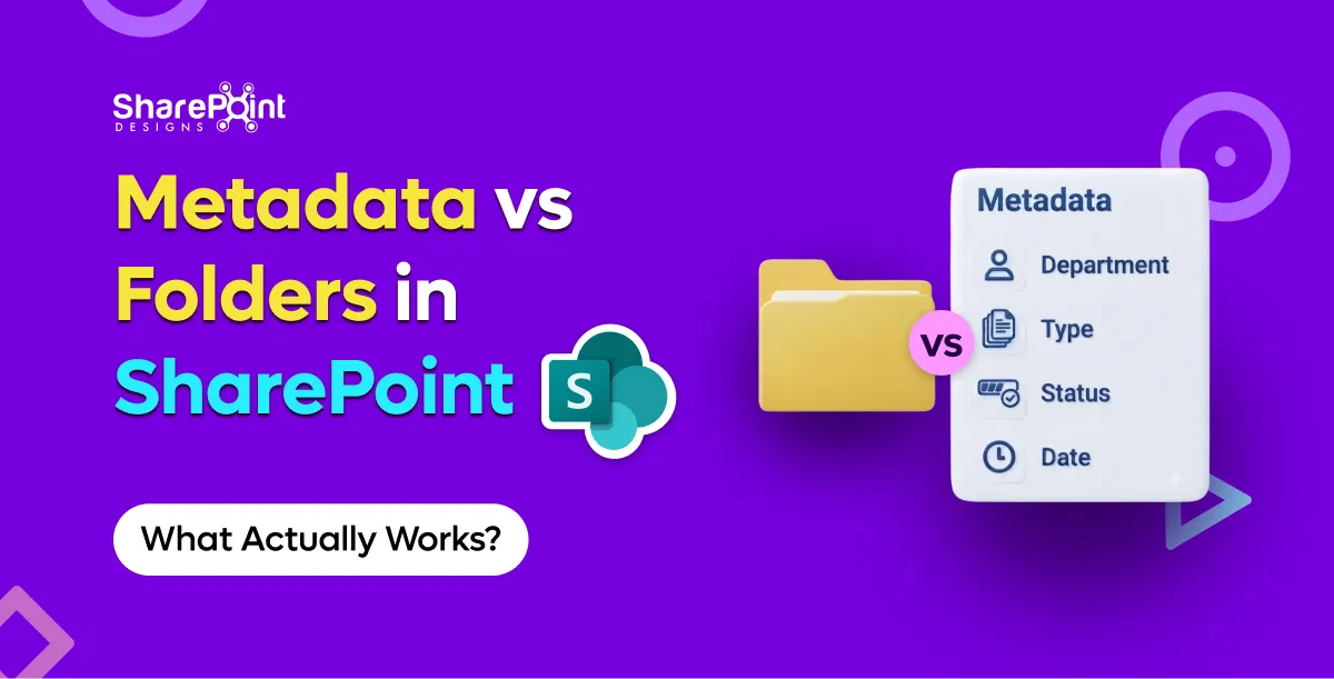
Metadata vs Folders in SharePoint: What Actually Works
Someone on every project asks for “the same folder structure as the file share.” I get it. Folders map to how people already think.
Buyers ask for a number. Fair. Too many vendors answer with a fog machine.
Here is the clean version: Microsoft 365 already includes SharePoint. The cost of a SharePoint document management system is mostly design, process packaging, and change — not "storage." DocVault is our packaged SharePoint DMS: flat one-time, unlimited users, running inside your M365 tenant. Current pricing lives only on the DocVault product page — not in this article.
I will not invent $10k–$150k project bands to sound analyst-y. Those ranges show up in internet folklore and usually mix unrelated scopes: migrations, custom apps, change programmes, and software seats. If a blog quotes them without a bill of materials, treat it as decoration.
First cost fact: you may already own the platform
SharePoint Online is part of Microsoft 365 for licensed users. Teams, Office co-authoring, Entra ID, and search sit in the same estate.
So when someone says "how much is SharePoint DMS?" separate:
- Platform you already pay for — M365 / SharePoint
- Compliance features tied to your M365 SKU — Purview retention and labels depend on what you licensed
- Design and implementation labour — information architecture, permissions, training
- Packaged DMS software (optional) — closes OOTB gaps
- Ongoing ownership — admins, document controllers, small enhancements
Item 1 is not zero, but it is often sunk. Quoting SharePoint like a net-new ECM buy misleads Finance.
What you get OOTB vs what you still pay to create
SharePoint OOTB includes versioning, co-authoring, Purview retention/labels (with the right posture), and search.
It does not include auto numbering, multi-stage approval with escalation, scheduled review with pre-expiry, read-and-acknowledge, or a governed template creation dashboard.
Those gaps drive cost either as DIY labour or as a product fee. Pillar thinking (classification, lifecycle, control, access) is covered in Can SharePoint Be a Document Management System?.
DocVault packaging (price on the product page)
We keep the dollar figure on the DocVault landing page so it stays accurate when packaging changes. What this article will say clearly:
- One-time packaging (not a per-user SaaS seat tax for DocVault itself)
- Unlimited users under that model
- Runs inside your Microsoft 365 tenant — nothing leaves the tenant as part of the product model
- Trial is a hosted demo with sample data, not an instant install into your production tenant
If you need the number for a business case, take it from the product page the day you quote Finance. Blogs go stale; that page should not.
Per-seat DMS vs flat: why Finance cares
Specialist DMS tools often charge per user. Fine for a small controlled circle. Awkward when:
- Plant supervisors need read access
- All staff must acknowledge policies
- Auditors want broad evidence trails
- Contractors rotate
Per-seat models punish inclusive access. Flat packaging inside M365 flips that incentive: you design access for the work, not for the licence spreadsheet.
M-Files is the frequent RFP alternative: separate platform, per-user, strong when connecting non-Microsoft repos. Honest take — M-Files wins when your estate is outside M365. Inside Microsoft-first estates, flat SharePoint packaging is usually the cheaper operational story. Full comparison: SharePoint vs M-Files in 2026.
DIY cost is mostly labour and time
Building with content types + Power Automate + a homepage looks free on the software line.
You still pay for:
- Workshops and taxonomy decisions
- Flow build, rewrite, and edge-case fixing
- Test cycles across document types
- Training
- Break/fix when the maker leaves
Custom consulting historically appeared around $50/hr on site in our older delivery context. Use that only as a labour reminder. Hours stack. I will not multiply them into fictional project totals — your scope owns that maths.
The expensive DIY failure mode is not the first flow. It is the third rewrite after escalation rules change and the original builder is gone. That story sits in Build vs Buy a SharePoint Document Management System.
Cost drivers that matter more than sticker price
Scope of controlled behaviour
A contracts library with one approval stage is not the same as quality-controlled SOPs with acknowledgements and review cycles. Price conversations that ignore scope are theatre.
Number of document domains
HR policies, engineering specs, and supplier quality packs rarely share one happy content type. More domains means more design — whether you buy software or not.
Library architecture
Ignore the 5,000-item view threshold and Microsoft's ~100,000 items per library guidance and you will fund remediation later. Remediation is cost. Plan libraries before you celebrate go-live.
Migration entropy
Moving from file shares, Dropbox, or Drive? Expect classification work. Sync tools optimise for speed; company DMS optimises for control — see SharePoint Document Management vs Dropbox and Google Drive. Copying every folder "just in case" is a cost decision dressed as safety.
Compliance evidence
SOX, ISO 27001, GDPR, HIPAA programmes care about audit trails, access, and retention you can show. DocVault and M365 controls can support that positioning through configuration. Do not budget as if a product fee buys a certification certificate by itself.
A simple cost model you can take to Finance
That table will get you further than a blog claiming every mid-market DMS lands in a magical five-figure band.
What failed when cost was the only slide
A buyer chose pure DIY to "save the licence fee," then spent months in approval edge cases across three departments. The packaged fee they avoided would have been cheaper than the calendar time. Another buyer wanted product packaging but refused taxonomy work — software fee spent, chaos retained.
It depends on whether your bottleneck is missing product behaviour or missing decisions. Software cannot outspend indecision forever.
Across 23 countries of delivery work, the pattern repeats: clear requirements make flat packaging look obvious; fuzzy requirements make any price look high.
How to evaluate trial economics without fooling yourself
DocVault's trial is a hosted demo with sample data. Good for understanding UX and controlled-document behaviours. Bad as a substitute for your permission model and content types.
Budget a short discovery either way. Skipping discovery to "save money" is how migrations get re-done.
Bottom line
A SharePoint DMS costs whatever you spend above the Microsoft 365 estate you likely already own: labour to design a real system, plus optional packaging for the OOTB gaps. DocVault's answer is flat one-time packaging with unlimited users in-tenant; get the current figure from the product page. Per-seat platforms and DIY flow farms can both exceed that in practice depending on audience size and maintenance reality.
If that commercial model matches a Microsoft-first controlled document need, look at DocVault — flat one-time, unlimited users, runs inside your tenant. Current pricing is on that page. For broader solution framing, use the document management system guide.
How Much Does a SharePoint Document Management System Cost?
The cost of a SharePoint document management system is mostly design, process packaging, and change not "storage."
Build vs buy in SharePoint is rarely about ideology. It is about who will still understand the approval escalation path in eighteen months.
I like Power Automate. I have shipped a lot of it. I have also inherited tenants where the "DMS" was seventeen flows, three orphaned solutions, and a document controller who knew which flow to turn off when Finance complained. That is not empowerment. That is key-person risk wearing a Microsoft badge.
If you are still deciding whether SharePoint can be a DMS at all, read Can SharePoint Be a Document Management System?. This post assumes the answer is yes — and asks whether you should assemble the missing pieces yourself or buy a packaged layer.
What "build" usually means in 2026
On Microsoft 365, DIY SharePoint DMS typically looks like:
- Content types and columns (good — do this either way)
- Power Automate approval flows
- Maybe Power Apps forms
- Retention labels via Purview
- A SharePoint page pretending to be a dashboard
- Naming conventions enforced by training and hope
Sometimes add Spfx or custom scripting if someone had budget and a deadline.
That stack can work. It works best when requirements are shallow and ownership is clear.
What SharePoint OOTB already covers
Do not rebuild Microsoft.
You already get versioning, co-authoring, search, and Purview retention/labels (with the right compliance posture). Those are not reasons to buy anything.
SharePoint OOTB still does not give you:
- Auto numbering
- Multi-stage approval with escalation
- Scheduled review with pre-expiry
- Read-and-acknowledge
- Governed template creation dashboard
Build vs buy is mostly about those gaps — plus how polished you need role permissions, audit trails, and Copilot-oriented auto-tag/search to be on day one.
When DIY + Power Automate is enough
Build when most of these are true:
- One or two approval stages, same path for most docs.
- Escalation is a nice-to-have, not an audit finding waiting to happen.
- Review dates can live as a column plus a simple reminder pattern.
- Numbering can be manual or lightly scripted without political drama.
- You have an owner who will maintain flows after go-live — named human, not "the IT team."
- Template governance is a small library of content types, not a factory.
I am fine recommending DIY in that lane. Paying for packaging to impress a steering committee is waste.
Also build when you need deep custom behaviour unique to one line of business and no product will ever match it without becoming a second custom project anyway.
When packaged (DocVault) wins
Buy when several of these show up:
- Multi-stage approvals with escalation across Quality, Ops, and Legal
- Scheduled review with pre-expiry that must run without heroics
- Read-and-acknowledge for policies
- Auto numbering stakeholders will argue about if it drifts
- Template creation that needs governance, not a free-for-all
- You want role permissions and audit-oriented patterns without designing every screen
- You want Copilot AI search/auto-tag sitting on a coherent package rather than bolted scripts
DocVault is the packaged option we ship for that profile: runs inside the customer M365 tenant, nothing leaves the tenant, one-time pricing (see the product page) flat, unlimited users. Uses existing Microsoft 365 licences. Trial is a hosted demo with sample data — useful for UI and flow feel, not a substitute for tenant discovery.
Compared with per-seat specialist platforms, flat-inside-M365 packaging is a different economic animal. For SharePoint vs M-Files honesty — including when M-Files still wins outside Microsoft estates — see SharePoint vs M-Files in 2026.
The failure mode: flows that break after the builder leaves
Here is the pattern.
A strong internal maker builds v1. Approvals work. Everyone claps. The maker gets promoted or leaves. A connection reference expires. An Entra group is renamed. A content type gains a required column. The flow starts failing on 8% of items — enough to destroy trust, not enough to page anyone at 2 a.m.
Document controllers invent a parallel spreadsheet. Shadow process beats official process. Leadership says "SharePoint doesn't work." SharePoint was fine. The operating model was a person.
What failed on a project I still think about: we delivered a clever branching approval with adaptive expressions nobody else could read. It was elegant. It was also unmaintainable. When requirements changed, the business waited four weeks for the one person who understood it. We should have bought packaging for the commodity path and reserved custom build for the true exceptions. It depends on whether your "unique" process is actually unique — or just historically messy.
Hidden DIY costs (labour, not licence fantasy)
DIY cost is mostly labour and time:
- Discovery and information architecture (you need this for buy too)
- Flow build and rewrite cycles
- Test matrices across doc types
- Training and re-training
- Break/fix ownership
- Re-work when Microsoft connects or actions change behaviour
Custom consulting historically showed up around $50/hr on site in our older delivery model. I mention that only as a reminder that hours multiply quietly — not to invent project price bands. Your internal loaded cost may be higher than you think once you count meetings.
Buy shifts some of that into a known product fee and a supportable surface. It does not remove change management. Anyone who says otherwise is selling theatre.
For the cost anatomy with DocVault's current pricing on the product page anchor and why M365 already includes SharePoint,
A decision table I use with buyers
If your real problem is Dropbox/Drive shadow IT rather than SharePoint gaps, fix the category confusion first: SharePoint Document Management vs Dropbox and Google Drive.
Implementation notes either path still needs
Architecture still matters
The 5,000-item view threshold and ~100,000 items per library guidance do not disappear because you bought software. Package or DIY, bad libraries stay bad.
Compliance is configuration
SOX, ISO 27001, GDPR, HIPAA conversations should focus on audit trails, access, and retention you can demonstrate. Packaged controls help. They are not a certificate you hang on the wall without design evidence.
Classification is not optional
Buy a product with auto-tag and you can still create garbage metadata. Content types and ownership remain human work.
Practical recommendation
Start with requirements severity, not brand preference.
If your gaps are shallow and ownership is real, build on SharePoint OOTB + Purview + modest Power Automate. Keep the flows boring on purpose.
If your gaps match controlled-document product territory numbering, multi-stage escalation, scheduled review, acknowledgements, template governance — buy a SharePoint-native package and spend custom effort on the few processes that truly differentiate you.
That is the grown-up version of build vs buy.
For teams choosing the packaged SharePoint path inside Microsoft 365, see DocVault.
Solution background: document management system guide.
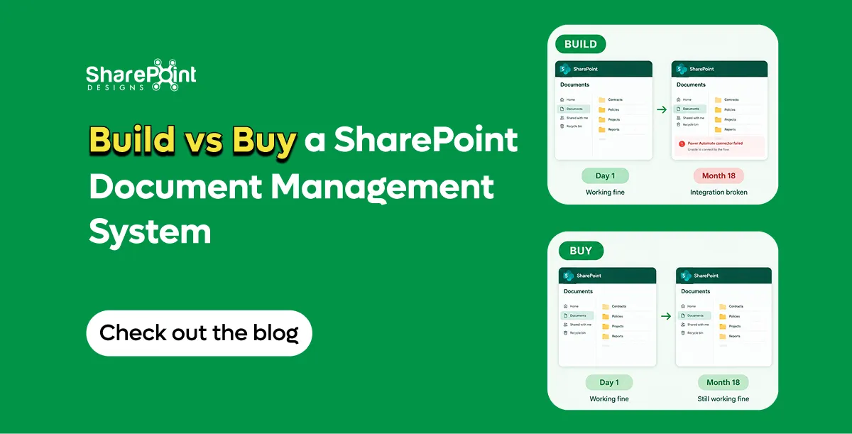
Build vs Buy a SharePoint Document Management System
Build vs buy in SharePoint is rarely about ideology. It is about who will still understand the approval escalation path in eighteen months.


.svg)